Is your branding strong enough to handle the changing tides?
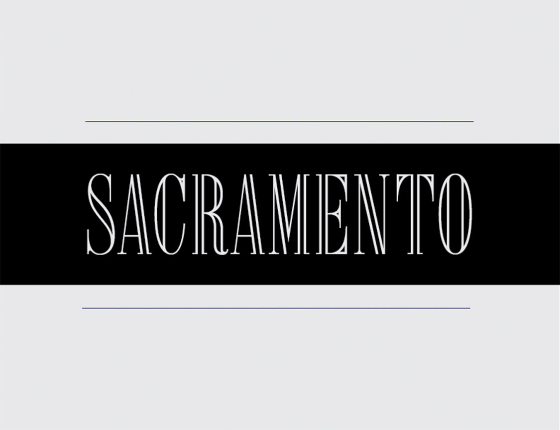
This was from a sticker I designed for a Dribbble.com weekly design exercise. The challenge was to design a sticker that represents your hometown. While Sacramento to me represents many things, I went with something that could be understood at first glance. Something classy, bougie, r… j/k.😜 I selected a classic typeface but with something a little extra. The pillars in the letters are indicative of the pillars on the capital building which the city is widely known for. It’s important to think about what foundation has already been set in your viewer's mind. What things may already come to mind when visually communicating with your viewer? Although you may have a certain taste you need to think about it from your viewer's perspective. You want to make sure that In the midst of telling your brand story, you don’t throw the viewer off track. Colors, typefaces, the aesthetic of the imagery all play a part in representing your brand. They all play a huge part in what you are trying to communicate. Although your products and services can change with the trends when creating your brand you want to make sure to stick to something that you have the strongest ties to. Something that can be quickly understood. It will be your anchor amongst all the changing tides of what is “popular” or “trending”.