How do I create my brand? The process of Akushio: Brand Case Study (Part 2)
This is a continuation of the process of Akushio. Here are a few of the business card concepts with a previous color palette that we were originally going to go with. I wanted something with either curved lines or curved color blocking. This was to represent a simple clean modern aesthetic that would represent a minimalist yet high-quality lifestyle.

After perfecting the mood board to be more tailored to the representation of the brand, there was a need to make changes in the color palette. That is why it is really important to get the mood board right so we can move forward in confidence. After we looked at these concepts and some other examples we chose what was working and what wasn’t in accordance with the desired aesthetic, The client wanted the brand to embody the values of joy, approachability and care. With this I wanted something that had curved lines to represent a nurturing and fluid feel. The colors represent heart, joy and style. I designed these concepts for the front of the business card.
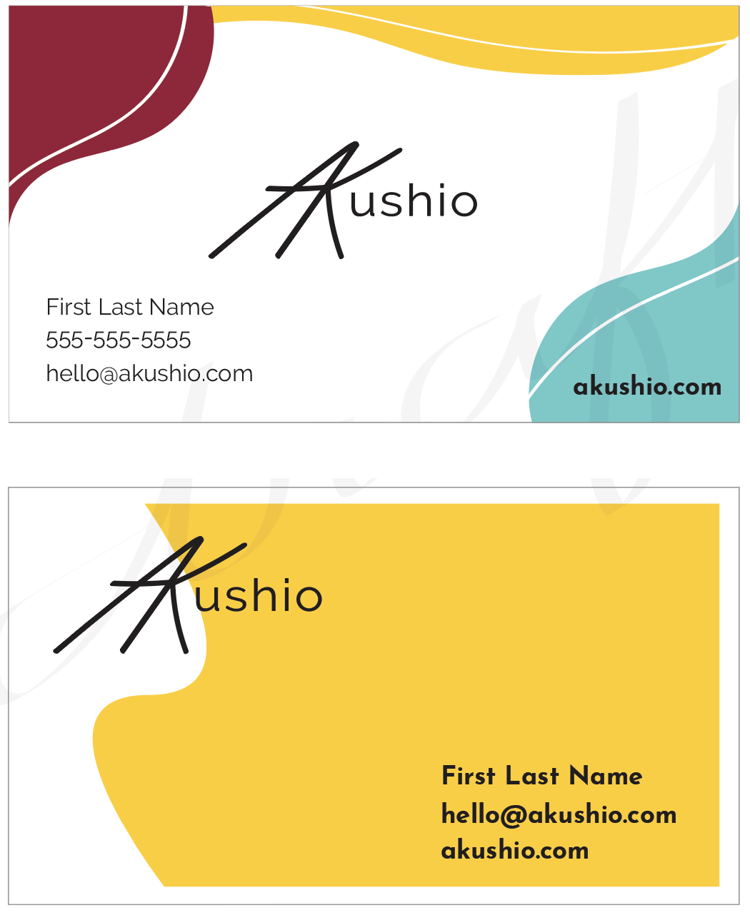
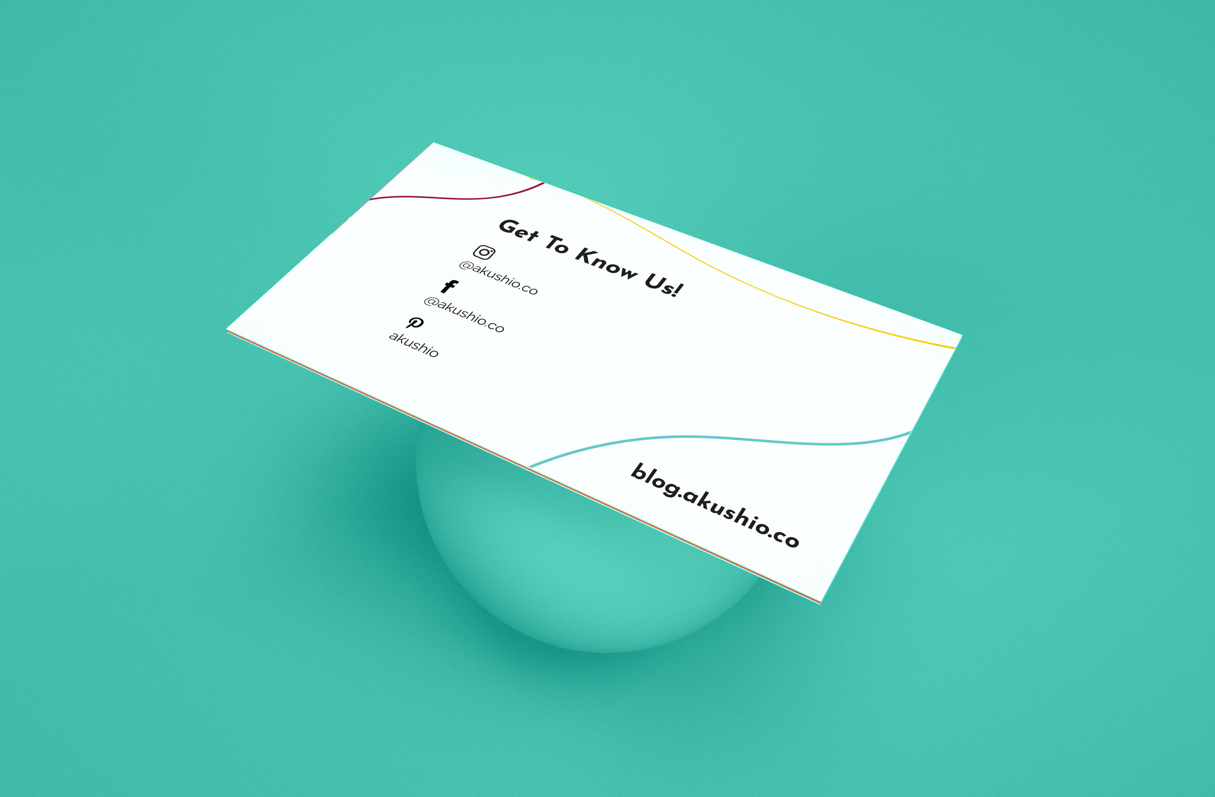
We went with the first one. For the back of the business card I did a similar yet more minimal version of this concept. We added the social media icons so people will know where to find the brand on social media applications.

Since my client ordered both the print and digital assets, I then proceeded to design her Facebook cover for her business page using the same concept we landed on for the business card. We also dressed up her Instagram account with highlight icons in her brand colors!

Overall the challenge was to help the guide the client in what she liked and what was going to work in terms of creating a consistent aesthetic. Her response was “I'm super happy with everything and really like the direction we're going.”
For more updates on Akushio.co you can follow on Instagram @akushio.co